Perhaps try imageshack?
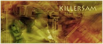
My first serious effort.
Moderator: Core Staff


-
Soviet

- Core Staff

- Posts: 7762
- Joined: April 23rd, 2005, 9:12 pm

-
Neon

- Too cool for CoDJumper

- Posts: 3535
- Joined: April 21st, 2005, 8:54 pm
- Location: England, Redditch
the "S" looks wrong imo ;/ Looks like it's a different font. Otherwise the text is great.
was there a render of someone's head? Looks like it lol, but the oppacity is really low.
I prefer Sam's color sceme tbh Soviet ;/
was there a render of someone's head? Looks like it lol, but the oppacity is really low.
I prefer Sam's color sceme tbh Soviet ;/

"If we can hit that bull's-eye, the rest of the dominoes will fall like a house of cards...Checkmate."
"Seriously... .45k/sec it is a joke.. I could have just gone out and taken my own photos of children in this time."
"You have just become my fave youtuber!" - KillerSam in regards to myself. Win.
-
Neon
- Too cool for CoDJumper
- Posts: 3535
- Joined: April 21st, 2005, 8:54 pm
- Location: England, Redditch
The text is good, but the S just looks like you've changed it?
blue looks abit plain, multi colouring ftw
blue looks abit plain, multi colouring ftw
"If we can hit that bull's-eye, the rest of the dominoes will fall like a house of cards...Checkmate."
"Seriously... .45k/sec it is a joke.. I could have just gone out and taken my own photos of children in this time."
"You have just become my fave youtuber!" - KillerSam in regards to myself. Win.
-
waywaaaard

- Core Staff
- Posts: 2214
- Joined: February 6th, 2006, 3:18 pm
- Location: Germany/Bayern
if you use such bright colours u should better work out the render so that is comes out of the background a bit maybe work with adjustments-layers - I know it sounds stupid
maybe u have a look at that
http://sagie.com/colormatch.html
or here http://www.colormatch.dk/
and here the best i think
http://traumwind.de/blog/trw_colormatch.html
maybe u have a look at that
http://sagie.com/colormatch.html
or here http://www.colormatch.dk/
and here the best i think
http://traumwind.de/blog/trw_colormatch.html
THAT HANDS WERE NOT TRACED!
visit my blog: Link
visit my blog: Link
Soviet wrote:Yeah, watch out, Peds will hit you with his +5 D-Battleaxe of homosexuality
-
Drofder2004

- Core Staff
- Posts: 13315
- Joined: April 13th, 2005, 8:22 pm
- Location: UK, London

-
Rezil

- Core Staff
- Posts: 2030
- Joined: July 24th, 2006, 11:21 am
- Location: Cramped in a small cubicle/making another jump map


-
Soviet
- Core Staff
- Posts: 7762
- Joined: April 23rd, 2005, 9:12 pm
i agree with you ks on the colors. I have no problem for the major coloring, its just it was a bit too bright. I was just too lazy to actually do it properly. Tone it down a bit, then the white border. As for the text it goes perfectly with the sig, and i think the reason the s looks different is because it is capitalized.
I guess something as simple as this would have worked...
(go to image>adjustments>hue/saturation then just turn down the saturation a bit and then the lightness a little to make it have more contrast.)
I guess something as simple as this would have worked...
(go to image>adjustments>hue/saturation then just turn down the saturation a bit and then the lightness a little to make it have more contrast.)
-
[SoE]_Zaitsev

- Core Staff
- Posts: 14220
- Joined: October 21st, 2004, 7:17 pm
- Location: Holland
- Contact:
-
waywaaaard
- Core Staff
- Posts: 2214
- Joined: February 6th, 2006, 3:18 pm
- Location: Germany/Bayern
your renders arent really in the sig or the backgrounds doesnt fit to it :-/ so your first you posted was the best
THAT HANDS WERE NOT TRACED!
visit my blog: Link
visit my blog: Link
Soviet wrote:Yeah, watch out, Peds will hit you with his +5 D-Battleaxe of homosexuality
-
[SoE]_Zaitsev
- Core Staff
- Posts: 14220
- Joined: October 21st, 2004, 7:17 pm
- Location: Holland
- Contact: