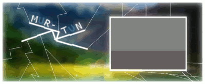
The graphics forum (images and design) - self explanatory really!
Moderator: Core Staff
-
murtun
- CJ Wannabe

- Posts: 19
- Joined: December 3rd, 2009, 11:00 pm
-
Contact:
Post
by murtun » November 19th, 2010, 5:52 pm
Afther half a year i have made a new Signature.
V1
Pretty weird that this one is my V2, but you got to let your mind go xD.
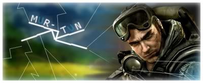
V2
The glow around the letters has not been faded out nicely but i couldn't get the layer bigger.
Murtun
-
F |Madness| U
- CJ G0D!

- Posts: 1575
- Joined: June 3rd, 2009, 9:02 pm
- Location: Cardiff University, UK
Post
by F |Madness| U » November 19th, 2010, 6:39 pm
I don't understand the point of that grey box, looks kinda ugly to me. I think it would look better with the picture in V1, or just no picture/grey box at all.
-
-
Hoogie
- Core Staff

- Posts: 3974
- Joined: September 2nd, 2008, 10:22 am
- Location: Holland
Post
by Hoogie » November 19th, 2010, 7:09 pm
madnesslink5 wrote:I don't understand the point of that grey box, looks kinda ugly to me. I think it would look better with the picture in V1, or just no picture/grey box at all.
-
murtun
- CJ Wannabe

- Posts: 19
- Joined: December 3rd, 2009, 11:00 pm
-
Contact:
Post
by murtun » November 19th, 2010, 7:11 pm
I made one that had something in the grey box but it didn't work (.gif). you didn't see it good enough.
But i'l try to figure something out for the grey box:P.
*EDIT
?
Murtun
-
Drofder2004
- Core Staff

- Posts: 13315
- Joined: April 13th, 2005, 8:22 pm
- Location: UK, London
Post
by Drofder2004 » November 19th, 2010, 8:32 pm
Stick to the render. A plain grey box is just silly.
If you are gonna do something like that, you need to use some gradients to give a little depth to it.
Virgin Media 20Mb Broadband:
"Perfect for families going online at the same time, downloading movies, online gaming and more."
Borked internet since: 22-07-2010
-
suNk1z
- CJ Wannabe

- Posts: 24
- Joined: November 27th, 2011, 12:40 pm
- PSN ID: suNk1z-
- Location: In a house somewhere in Europe.
-
Contact:
Post
by suNk1z » November 27th, 2011, 1:10 pm
i don't get the grey square 2 but, to make this better i think you should improve with a better font and with new colors

but this is just my opinion

-
F |Madness| U
- CJ G0D!

- Posts: 1575
- Joined: June 3rd, 2009, 9:02 pm
- Location: Cardiff University, UK
Post
by F |Madness| U » November 27th, 2011, 1:32 pm
I'm sure he's chosen his signature now, 1 year after the topic was originally made.

-
Users browsing this forum: No registered users and 1 guest