Comments on my new sig please...
Moderator: Core Staff
-
Neon

- Too cool for CoDJumper

- Posts: 3535
- Joined: April 21st, 2005, 8:54 pm
- Location: England, Redditch
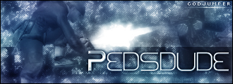
Apart from the size, no border and the text, i'm loving it mate

"If we can hit that bull's-eye, the rest of the dominoes will fall like a house of cards...Checkmate."
"Seriously... .45k/sec it is a joke.. I could have just gone out and taken my own photos of children in this time."
"You have just become my fave youtuber!" - KillerSam in regards to myself. Win.
-
Drofder2004

- Core Staff

- Posts: 13315
- Joined: April 13th, 2005, 8:22 pm
- Location: UK, London
-
Lethal323

-
Neon
- Too cool for CoDJumper
- Posts: 3535
- Joined: April 21st, 2005, 8:54 pm
- Location: England, Redditch
Well atm, the text is too small in relation to the empty bit around it. I wouldn't use that font, doesn't fit with the theme of the sig. I think you've done render clouds on the text which doesn't really work.
I think a bold and large font would work best here, and would probably look best if it was set diagonally.
http://www.dafont.com have a browse throught what would look good.
I think a bold and large font would work best here, and would probably look best if it was set diagonally.
http://www.dafont.com have a browse throught what would look good.
"If we can hit that bull's-eye, the rest of the dominoes will fall like a house of cards...Checkmate."
"Seriously... .45k/sec it is a joke.. I could have just gone out and taken my own photos of children in this time."
"You have just become my fave youtuber!" - KillerSam in regards to myself. Win.
-
[SoE]_Zaitsev

- Core Staff
- Posts: 14220
- Joined: October 21st, 2004, 7:17 pm
- Location: Holland
- Contact:
-
Lethal323
-
Neon
- Too cool for CoDJumper
- Posts: 3535
- Joined: April 21st, 2005, 8:54 pm
- Location: England, Redditch
I'm sure its one of these
Visitor TT1 BRK
Visitor TT2 BRK
Visitor TT1 BRK
Visitor TT2 BRK
"If we can hit that bull's-eye, the rest of the dominoes will fall like a house of cards...Checkmate."
"Seriously... .45k/sec it is a joke.. I could have just gone out and taken my own photos of children in this time."
"You have just become my fave youtuber!" - KillerSam in regards to myself. Win.
-
Drofder2004
- Core Staff
- Posts: 13315
- Joined: April 13th, 2005, 8:22 pm
- Location: UK, London
Take off about 150px in width from the left at least, and then a good bold (yet dull coloured, ie grey) font with a few simple effects (border and shadow) and it should be good.

Virgin Media 20Mb Broadband:
"Perfect for families going online at the same time, downloading movies, online gaming and more."
Borked internet since: 22-07-2010