Page 1 of 1
Showing stuff
Posted: September 21st, 2008, 4:11 pm
by session.nl
Re: Showing stuff
Posted: September 21st, 2008, 4:14 pm
by Pedsdude
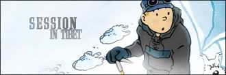
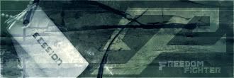
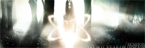
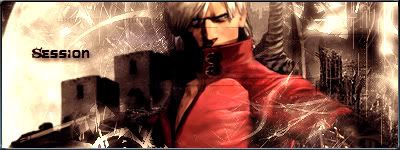
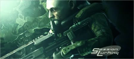
Very nice! I particularly liked 3, 4, 7, 9 and 12

Re: Showing stuff
Posted: September 21st, 2008, 4:38 pm
by session.nl
ghehe thx mates for the fast replies i'm working right now with c4d and photoshop to make a new sig after a year ^^
Re: Showing stuff
Posted: September 21st, 2008, 5:47 pm
by session.nl
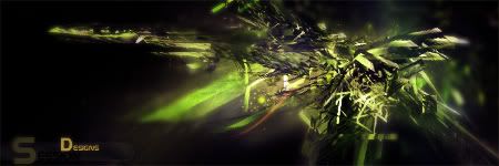
v1

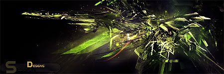
v2

Which one is better? all made by my sellf no costum brush no downloaded renders. all made in photoshop and c4d.

Re: Showing stuff
Posted: September 21st, 2008, 5:53 pm
by [SoE]_Zaitsev
I liked 2, 7 & 12.
For the other 2 sigs, I'd take the bottom one, it's much sharper.
Re: Showing stuff
Posted: September 21st, 2008, 8:37 pm
by Neon
Out of the 2 I prefer the bottom, but I think it needs more blurring.
Re: Showing stuff
Posted: September 22nd, 2008, 12:49 am
by Pedsdude
I agree with the others, the bottom one is better. Maybe a level of blurring in between the 2 would be best. Also a nice border would do wonders (even if it's just a 1 px line border). Also, are you meant to read 'session'? I can see the 'S' and 'Designs' (on a separate note, is there a very small 'i' in there or is it missing? Can't tell), but the 'ession' bit is very dark.
