Showing stuff

The graphics forum (images and design) - self explanatory really!

Moderator: Core Staff

Post Reply
session.nl
CJ Wannabe
CJ Wannabe
Posts: 3
Joined: September 21st, 2008, 3:52 pm

Showing stuff

Post by session.nl » September 21st, 2008, 4:11 pm

Image
Image
Image
Image
Image
Image
Image
Image
Image
Image
Image
Image
Image
Image
Image

these are a few of my sigs hope you like them.

Pedsdude
Site Admin
Site Admin
Posts: 15909
Joined: October 15th, 2004, 7:18 pm
Location: UK

Re: Showing stuff

Post by Pedsdude » September 21st, 2008, 4:14 pm

Very nice! I particularly liked 3, 4, 7, 9 and 12 :)
Image
Image

session.nl
CJ Wannabe
CJ Wannabe
Posts: 3
Joined: September 21st, 2008, 3:52 pm

Re: Showing stuff

Post by session.nl » September 21st, 2008, 4:38 pm

ghehe thx mates for the fast replies i'm working right now with c4d and photoshop to make a new sig after a year ^^

session.nl
CJ Wannabe
CJ Wannabe
Posts: 3
Joined: September 21st, 2008, 3:52 pm

Re: Showing stuff

Post by session.nl » September 21st, 2008, 5:47 pm

v1 Image

v2 Image

Which one is better? all made by my sellf no costum brush no downloaded renders. all made in photoshop and c4d. :D

User avatar
[SoE]_Zaitsev
Core Staff
Core Staff
Posts: 14220
Joined: October 21st, 2004, 7:17 pm
Location: Holland
Contact:

Re: Showing stuff

Post by [SoE]_Zaitsev » September 21st, 2008, 5:53 pm

I liked 2, 7 & 12.

For the other 2 sigs, I'd take the bottom one, it's much sharper.
matt101harris wrote:big cock was the first thing that came to my head lol

User avatar
Neon
Too cool for CoDJumper
Posts: 3535
Joined: April 21st, 2005, 8:54 pm
Location: England, Redditch

Re: Showing stuff

Post by Neon » September 21st, 2008, 8:37 pm

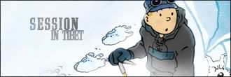
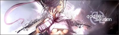
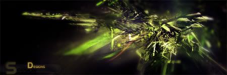
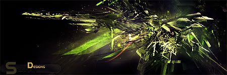
Out of the 2 I prefer the bottom, but I think it needs more blurring.
Image
"If we can hit that bull's-eye, the rest of the dominoes will fall like a house of cards...Checkmate."
"Seriously... .45k/sec it is a joke.. I could have just gone out and taken my own photos of children in this time."
"You have just become my fave youtuber!" - KillerSam in regards to myself. Win.

Pedsdude
Site Admin
Site Admin
Posts: 15909
Joined: October 15th, 2004, 7:18 pm
Location: UK

Re: Showing stuff

Post by Pedsdude » September 22nd, 2008, 12:49 am

I agree with the others, the bottom one is better. Maybe a level of blurring in between the 2 would be best. Also a nice border would do wonders (even if it's just a 1 px line border). Also, are you meant to read 'session'? I can see the 'S' and 'Designs' (on a separate note, is there a very small 'i' in there or is it missing? Can't tell), but the 'ession' bit is very dark.
Image
Image

Post Reply

Who is online

Users browsing this forum: No registered users and 3 guests