
Perhaps try imageshack?
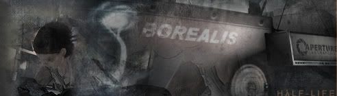
My first serious effort.
Moderator: Core Staff


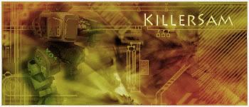
don't like the colors, but the actual look is awesome. I prefer a more simple color scheme like below, but thats just me.

and maybe make the border match the white line theme that you have going on throughout the rest of the sig. extremely good for first serious attempt though
and maybe make the border match the white line theme that you have going on throughout the rest of the sig. extremely good for first serious attempt though


"Zaitsev is a cunt." - Pedsdude
-
Neon

- Too cool for CoDJumper

- Posts: 3535
- Joined: April 21st, 2005, 8:54 pm
- Location: England, Redditch
the "S" looks wrong imo ;/ Looks like it's a different font. Otherwise the text is great.
was there a render of someone's head? Looks like it lol, but the oppacity is really low.
I prefer Sam's color sceme tbh Soviet ;/
was there a render of someone's head? Looks like it lol, but the oppacity is really low.
I prefer Sam's color sceme tbh Soviet ;/

"If we can hit that bull's-eye, the rest of the dominoes will fall like a house of cards...Checkmate."
"Seriously... .45k/sec it is a joke.. I could have just gone out and taken my own photos of children in this time."
"You have just become my fave youtuber!" - KillerSam in regards to myself. Win.
-
Neon
- Too cool for CoDJumper
- Posts: 3535
- Joined: April 21st, 2005, 8:54 pm
- Location: England, Redditch
The text is good, but the S just looks like you've changed it?
blue looks abit plain, multi colouring ftw
blue looks abit plain, multi colouring ftw
"If we can hit that bull's-eye, the rest of the dominoes will fall like a house of cards...Checkmate."
"Seriously... .45k/sec it is a joke.. I could have just gone out and taken my own photos of children in this time."
"You have just become my fave youtuber!" - KillerSam in regards to myself. Win.
-
waywaaaard

- Core Staff

- Posts: 2214
- Joined: February 6th, 2006, 3:18 pm
- Location: Germany/Bayern
if you use such bright colours u should better work out the render so that is comes out of the background a bit maybe work with adjustments-layers - I know it sounds stupid
maybe u have a look at that
http://sagie.com/colormatch.html
or here http://www.colormatch.dk/
and here the best i think
http://traumwind.de/blog/trw_colormatch.html
maybe u have a look at that
http://sagie.com/colormatch.html
or here http://www.colormatch.dk/
and here the best i think
http://traumwind.de/blog/trw_colormatch.html
THAT HANDS WERE NOT TRACED!
visit my blog: Link
visit my blog: Link
Soviet wrote:Yeah, watch out, Peds will hit you with his +5 D-Battleaxe of homosexuality
-
Drofder2004

- Core Staff
- Posts: 13313
- Joined: April 13th, 2005, 8:22 pm
- Location: UK, London


i agree with you ks on the colors. I have no problem for the major coloring, its just it was a bit too bright. I was just too lazy to actually do it properly. Tone it down a bit, then the white border. As for the text it goes perfectly with the sig, and i think the reason the s looks different is because it is capitalized.
I guess something as simple as this would have worked...
(go to image>adjustments>hue/saturation then just turn down the saturation a bit and then the lightness a little to make it have more contrast.)
I guess something as simple as this would have worked...
(go to image>adjustments>hue/saturation then just turn down the saturation a bit and then the lightness a little to make it have more contrast.)
"Zaitsev is a cunt." - Pedsdude
-
[SoE]_Zaitsev

- Core Staff
- Posts: 14220
- Joined: October 21st, 2004, 7:17 pm
- Location: Holland
- Contact:
-
waywaaaard
- Core Staff
- Posts: 2214
- Joined: February 6th, 2006, 3:18 pm
- Location: Germany/Bayern
your renders arent really in the sig or the backgrounds doesnt fit to it :-/ so your first you posted was the best
THAT HANDS WERE NOT TRACED!
visit my blog: Link
visit my blog: Link
Soviet wrote:Yeah, watch out, Peds will hit you with his +5 D-Battleaxe of homosexuality
-
[SoE]_Zaitsev
- Core Staff
- Posts: 14220
- Joined: October 21st, 2004, 7:17 pm
- Location: Holland
- Contact:
Who is online
Users browsing this forum: No registered users and 31 guests