Page 1 of 1
Sig change
Posted: June 29th, 2006, 12:58 am
by red_gee
Made a new sig, what do you think?
Posted: June 29th, 2006, 1:10 am
by Drofder2004
Although very nice, the woman is a bit random

Seems like you are trying to many things for 1 sig, dumb it down a little, vibrant colours mixing with ingame screenshots and women = a little mess.
Sigs don't have to be "extravagant"

Posted: June 29th, 2006, 1:45 am
by red_gee
*W/o random girl*

Then I could move "/mp_carentan" to the left side and make it vertical
I kinda like it better without the girl, at least with that background, I couldn't decide though, and I spent so long cropping her and then smoothing her out I had to try it
I have a tank I could put there, but I think it would be too cluttered...As I think it is now
I wish we could embed flash on this bb, then I could make it dynamic, have a little of this or a little of that depending on the time or something
Posted: June 29th, 2006, 7:11 am
by Drofder2004
Looking better already. The only other thing I dont like at all is the background. the way the background goes very grey. it would look a lot better if it looked how it should do.
Posted: June 29th, 2006, 8:02 am
by Soviet
my big personal complaint is the text for your name, the color doesnt fit the picture at all and it covers it. Perhaps moving it to a side or corner and making it slightly smaller might be better so the picture is more visible.
Posted: June 29th, 2006, 3:24 pm
by Lisa
Way too busy..too much "wording" and those flags don't need to be there do they? Your name is too big and the wrong color as Soviet said, perhaps make it red?
Posted: June 29th, 2006, 6:32 pm
by Pedsdude
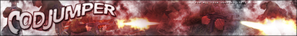
Yeah I agree, there is way too much going on at once, plus it doesn't really seem to have much of a colour theme. I suggest making all the 'background' text smaller and more opaque so they don't stand out so much (like on the CJ banner -
http://www.codjumper.com/images/cjbanner2.jpg)
Posted: June 29th, 2006, 11:54 pm
by red_gee
How is this?
I like it a lot better
I like the flags because it shows my history, my now is important, but I know I'm from Canada
I went with a different screen shot all together, that alows red_gee to go around it
It also contrasts the "seta" line better
But now the red_gee colour matches better, as the blue sky?
Just FYI, the colouring for red_gee is inverted flames
But no girl, it didn't match, shrunk the size, I dunno why my Carentan screen went the way it did, it was supposed to be "translucent" but that didn't seem to convert right
The only thing I'm not happy with is the line that protrudes where the sig divides the post, but I like the idea of an irregularly shaped sig (Soviet)
Posted: June 30th, 2006, 12:19 am
by Drofder2004
looking better

To counter the black line just add an extra 5 pixels on top of your sig and make them transparent.
Posted: June 30th, 2006, 12:23 am
by red_gee

Good idea Ty
Posted: June 30th, 2006, 2:56 am
by Soviet
i know...my sig is friggin awesome
joking
its looking much better now
Posted: July 1st, 2006, 5:49 pm
by waywaaaard
yeah it is not bad but i ve got sth to mention i would make sharp edges at the
http://www.codjumper.com and the pronunciation ( i mean the 45° lines)
i made a tutorial on
http://www.leviathan-design.dl.am ( but it is in german)