Thoughts
Moderator: Core Staff
-
[SoE]_Zaitsev

- Core Staff

- Posts: 14220
- Joined: October 21st, 2004, 7:17 pm
- Location: Holland
- Contact:
Re: Thoughts
Prefer the one NM made.
matt101harris wrote:big cock was the first thing that came to my head lol
-
Neon

- Too cool for CoDJumper

- Posts: 3535
- Joined: April 21st, 2005, 8:54 pm
- Location: England, Redditch
Re: Thoughts
I like it apart from the render, and how the render is intergrated. Text works well in my opinion.

"If we can hit that bull's-eye, the rest of the dominoes will fall like a house of cards...Checkmate."
"Seriously... .45k/sec it is a joke.. I could have just gone out and taken my own photos of children in this time."
"You have just become my fave youtuber!" - KillerSam in regards to myself. Win.
Re: Thoughts
render looks bad in there, rest is not bad...but nothing original


"Zaitsev is a cunt." - Pedsdude


Re: Thoughts
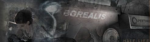
Text on the sig is WAY to simple + it seems like it has nothing to do with CoD :<
Only my opinion though.
Only my opinion though.

-
Neon
- Too cool for CoDJumper
- Posts: 3535
- Joined: April 21st, 2005, 8:54 pm
- Location: England, Redditch
Re: Thoughts
Other than it being the CJ team game tags^^ I like the text.
"If we can hit that bull's-eye, the rest of the dominoes will fall like a house of cards...Checkmate."
"Seriously... .45k/sec it is a joke.. I could have just gone out and taken my own photos of children in this time."
"You have just become my fave youtuber!" - KillerSam in regards to myself. Win.
Re: Thoughts
looks good, I like. Maybe turn down the saturation on the text a little though...the standing out and even the colors aren't too bad, but it is a little too colorful in comparison
"Zaitsev is a cunt." - Pedsdude
-
Drofder2004

- Core Staff
- Posts: 13313
- Joined: April 13th, 2005, 8:22 pm
- Location: UK, London
Re: Thoughts
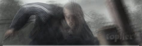
In the bottom right you have scan lines going over the top of curved tech brushes. Remove the scanlines (and fade them gradually)
Add a small (very slight) glow around the render using plain white. Small enough to barely notice the difference but enough to break the render from the background a little.
Add a small (very slight) glow around the render using plain white. Small enough to barely notice the difference but enough to break the render from the background a little.

Virgin Media 20Mb Broadband:
"Perfect for families going online at the same time, downloading movies, online gaming and more."
Borked internet since: 22-07-2010
-
Neon
- Too cool for CoDJumper
- Posts: 3535
- Joined: April 21st, 2005, 8:54 pm
- Location: England, Redditch
Re: Thoughts
I would of had the scan lines fade further down towards the text, otherwise I like it 
"If we can hit that bull's-eye, the rest of the dominoes will fall like a house of cards...Checkmate."
"Seriously... .45k/sec it is a joke.. I could have just gone out and taken my own photos of children in this time."
"You have just become my fave youtuber!" - KillerSam in regards to myself. Win.
Who is online
Users browsing this forum: No registered users and 35 guests