
Get some critique please?
Moderator: Core Staff
Get some critique please?
Haven't made anything in a while so I messed around a bit.


"Zaitsev is a cunt." - Pedsdude
-
[SoE]_Zaitsev

- Core Staff

- Posts: 14220
- Joined: October 21st, 2004, 7:17 pm
- Location: Holland
- Contact:
Re: Get some critique please?
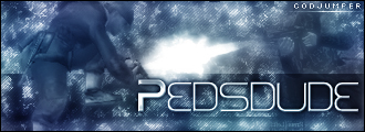
Looks nice and all but I can't say what it is.
matt101harris wrote:big cock was the first thing that came to my head lol


-
matt101harris
- PC Team

- Posts: 2369
- Joined: March 30th, 2008, 4:21 pm
- Location: South England
- Contact:
Re: Get some critique please?
It looks awsome mate, what is it?  like a heart or sumin

Re: Get some critique please?
I don't particularly like it, it seems a bit 'stock' to me, particularly the background which looks like a pattern you could use in Photoshop.
The text lets it down the most though. In my opinion, all the best sigs that stand out have text that stand out. Look at the CJ logo for example, and (to a lesser extent) my sig (which I admit wasn't made by me). Then there's your current sig, which I think is very good. This one in your original post looks like a repeated background with a basic-ish text slapped on the top.
I'm not saying I could do any better, I couldn't, but you did ask for critique

Re: Get some critique please?
It's actually fully unique brushwork but thanks for the comment Peds  Is there anything you would suggest to make it less 'stock'?
It's supposed to be a Reaver from Starcraft with a High Templar on top.
It's supposed to be a Reaver from Starcraft with a High Templar on top.
"Zaitsev is a cunt." - Pedsdude
-
[SoE]_Zaitsev
- Core Staff
- Posts: 14220
- Joined: October 21st, 2004, 7:17 pm
- Location: Holland
- Contact:
Re: Get some critique please?
ah I see it now.
matt101harris wrote:big cock was the first thing that came to my head lol
-
Drofder2004

- Core Staff
- Posts: 13313
- Joined: April 13th, 2005, 8:22 pm
- Location: UK, London
Re: Get some critique please?
I don't even play starcraft and could tell what it was from, sorta.
Sorry, don't like it.
- Lightning is tacky
- Render is hard to understand and too blurred
- Font is bad
- Character spacing on the text is wild ('ONI' to close together)
- Render use some purple, sig uses blue. colours don't really go.
This looks like something an average PS'r would do, I expect a higher level of quality from yourself!

Virgin Media 20Mb Broadband:
"Perfect for families going online at the same time, downloading movies, online gaming and more."
Borked internet since: 22-07-2010
Re: Get some critique please?
- The idea is that the High Templar can do a Psyonic Storm which is essentially a lightning storm which does massive damage to units, that's where I was getting the lightning from and I felt it was an integral part of the sig
- I had a lot of trouble with it, I usually work with high res images and while the Reaver was a nice size, I had a lot of trouble with the 100x100px High Templar plus actually getting him to look like he was sitting on the back of the Reaver instead of just standing there
- The font is the Starcraft font, I admit I didn't spend much time choosing, what kind of font would you recommend?
- That was the font, I made this sig at about 2am and I didn't notice, thanks for pointing it out
- I had trouble getting the render to fit as I wanted to preserve as much clarity as I could, however that sacrifices its unity with the signature. I suppose I could add some purple lightning and other brushwork to offset it.
Suggestions about my response to your critique?
Right now I know I need to change font (Peds/Droffy suggestions) and work a bit on the brushwork as well as do a 2 color scheme as opposed to one color.
"Zaitsev is a cunt." - Pedsdude
Re: Get some critique please?
I've never played Starcraft, so didn't recognise it.Soviet wrote:- The font is the Starcraft font, I admit I didn't spend much time choosing, what kind of font would you recommend?
Even so, I reckon you should make the font larger / stand out more. Good signatures either blend it in subtly or have it stand out at the forefront of the image - yours is indecisive.
I'm also not keen on the positioning on it - having it right in the centre suggests you didn't put much thought into the location of it (even if you did). I'm much more fond of either neat, small-ish text in the corner or text that takes a large percentage of the image.
Re: Get some critique please?
I tried several locations and ended up with the center, I'll try to make it fit in more when I work on it again.
"Zaitsev is a cunt." - Pedsdude
Who is online
Users browsing this forum: No registered users and 3 guests